Before they hear your intro music, before they read your show notes, before they even press play, a potential listener does one thing.
They scroll. And they are not alone. According to Edison Research's Infinite Dial 2025 report, there are now 115 million weekly podcast listeners in the U.S. alone. That means your logo is competing against a tidal wave of other shows every single week in someone's queue.
In that fraction of a second, as their thumb flies through a sea of options in Apple Podcasts or Spotify, they see a single, tiny square. That square is your show's face, your digital handshake. For new shows, effective podcast logos are the first and sometimes only chance to make someone stop.
Good content isn't enough to get discovered. In a world with this much competition, a compelling logo isn't a luxury; it's a requirement. It's the visual trigger that turns a passive scroller into an active listener.
This guide will show you what separates a forgettable thumbnail from an iconic brand. We'll deconstruct what works, show you how to do it, and make sure your show's first impression is one that sticks.
Why Your Logo Is More Than Just a Pretty Picture
It's tempting to treat your logo as a final to-do item, a box to check before launch. That's a mistake. Your logo is a strategic tool. With monthly podcast consumption rocketing to 55% of the population, standing out visually isn't optional.
- It's a Promise: It sets the tone instantly. Dark, moody colors and sharp fonts might suggest a true-crime thriller. Bright, playful illustrations could signal a comedy chat show. It tells listeners what to expect.
- It's a Hook: A great logo sparks curiosity. It poses a question or creates an emotion that makes someone want to know more. It's the difference between being seen and being remembered.
- It's Your Brand Anchor: This single image will live everywhere: on your website, your social media profiles, your video clips, your merchandise. A strong logo is the visual thread that ties your entire brand together, from your cover art to your podcast show notes strategy.
Deconstructing the Greats: The Anatomy of a Winning Logo
The most effective podcast logos aren't necessarily the most complex. They are the most thoughtful. They master four key elements.
Simplicity is Scalability
Your logo must work as a 3000x3000 pixel masterpiece and as a 50x50 pixel thumbnail on a crowded phone screen. Intricate details, multiple fonts, and excessive text become an illegible smudge at small sizes. The best logos are bold, clean, and instantly recognizable no matter how small they get.
The simple, clean typography of 99% Invisible is unmistakable at any size.
Color Tells a Story
Color is emotional shorthand. A black-and-white palette can feel serious and journalistic. A splash of neon can scream modern and edgy. A warm, earthy palette can feel comforting and intimate. Don't just pick your favorite colors; pick the colors that reflect the feeling of your show.
Typography is Your Tone of Voice
The font you choose says as much as the words themselves. A classic serif font can convey authority and tradition. A quirky, hand-drawn script can feel personal and creative. A clean, geometric sans-serif font can feel modern and tech-focused. Ensure the text is thick enough and clear enough to be read at a glance.
The classic serif font used by The Daily conveys authority and seriousness.
It's a Symbol, Not a Summary
Resist the urge to cram every aspect of your show into the logo. And please, unless you have a truly brilliant concept, step away from the microphone icon. A great logo evokes a single, powerful idea. My Favorite Murder uses a ransom-note font. Hidden Brain plays with typography to suggest something unseen. They don't show you everything; they make you feel something.
The ransom-note font for My Favorite Murder is instantly creepy, clever, and on-brand.
The Logo vs. Cover Art: Know the Difference
Let's clear this up, because the terms are often used interchangeably, but they aren't the same thing.
- Your Podcast Cover Art is the final, square image (1400px to 3000px) you upload to podcast directories. It contains your show's title, maybe your name, and the background imagery.
- Your Podcast Logo is a specific design element within that cover art. It can be a unique symbol, a stylized version of your show's name (a logotype), or a combination of both.
Think of it like an album. The album cover is the whole image. The band's stylized name in the corner? That's the logo. All podcasts need cover art. Not all have a distinct, separate logo, but the strongest brands usually do.
How to Make a Podcast Logo: Two Paths, One Goal
You have a clear vision for your podcast logo design. Now, how do you bring it to life?
The DIY Route: Tools for the Hands-On Creator
If you have more time than budget, or just a strong creative streak, you can absolutely design your own logo.
- Canva: The go-to for many creators. It's loaded with podcast cover art templates that are already the right size. Easy to use, with a huge library of fonts, graphics, and photos.
- Adobe Express: A strong Canva alternative with powerful, user-friendly design features and templates.
- AI Logo Makers: Services like Looka can generate dozens of options based on your style and industry. Fast, but can sometimes feel generic.
The Pro Route: Hiring a Designer
If you want a truly unique, professional look, hiring an expert is the best investment you can make in your brand.
- Fiverr: A marketplace full of freelance designers with packages starting at very affordable prices. Great for getting a solid, budget-friendly design.
- 99designs: You run a contest where multiple designers submit ideas based on your brief. You pick your favorite. More expensive, but you get a huge variety of concepts.
- Upwork: A platform to find and hire individual freelance designers for a specific project.
The Technical Checklist: Don't Get Rejected
Before you call it done, make sure your cover art file meets the non-negotiable standards that most platforms follow. Apple Podcasts, which sets the industry standard, requires the following:
- Dimensions: Square. Minimum 1400 x 1400 pixels, maximum 3000 x 3000 pixels. Bigger is better for quality.
- File Format: JPEG or PNG.
- Color Space: RGB.
- Readability: Make sure your logo and text are legible even when shrunk down to a tiny thumbnail.
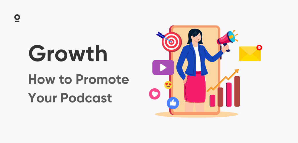
From Logo to Promotion: Making Your Brand Work
Your logo isn't the finish line. It's the starting gun. Once you have that perfect PNG from Canva or your designer, you need to put it to work creating a consistent brand everywhere.
This is where your creation process and your promotion process connect. A powerful logo deserves to be seen. When you're creating promotional clips from your episodes, that logo should be front and center. Zencastr's video recording and editing tools are built for this. Record in studio quality, then head to the editor. You can easily add your new logo as a persistent watermark to every video clip you generate, ensuring your brand is baked into every piece of content you share on YouTube Shorts, TikTok, or Instagram.
Clean audio builds trust. A professional logo builds recognition. When you use a single platform for both, your workflow becomes seamless.
Your First Impression Awaits
Don't overthink it, but don't underestimate it either. Great podcast logos are a vital piece of your show's DNA. They're the welcome mat that invites new listeners in and the familiar face that keeps them coming back. They're the first promise you make.
Make it a good one.